

Brand
guidelines.
Version 1.0 · October 2026 · Harrison Greener · Student ID 214313327
What’s
inside.
Own it.
Play it everywhere.
Stack is the home for the records people own. It turns a shelf of vinyl and CDs into a library you can play anywhere, share with family and sell on when you’re done.
Talk like a friend
who works in a record shop.
Short sentences. Plain words. Sentence case everywhere, no spaced-out capitals, no exclamation marks in product copy.
Four marks,
one family.



Give it
room to breathe.
Keep a clear space of at least x on every side, where x is the height of the S mark’s inner swoosh, about a quarter of the mark. Nothing else enters this space.
xxxxxxxxLockup minimum24px tall on screen · 8mm in printS mark minimum16px on screen · 5mm in printThe right logo
for every background.
Brown on light, cream on dark. On photos, place the logo over a calm area or a solid panel.
Cream✓Paper✓Night✓Espresso✓Stack orange✓White✓Sky✕Sunset red✕On a photo, put the logo on a solid panel in a calm corner, never over faces or products.
Things
never to do.
✕✕✕✕✕NEW! FREE! SALE!✕Side by side,
as equals.
When Stack works with a record shop, label or event, the two logos sit on one line, matched by visual height, divided by a thin rule.
2x2x- Stack comes first on Stack-led work: on the left, or on top when stacked.
- Equal height. Match the partner’s cap height to the Stack wordmark, never larger.
- Divider: a 2px rule in Cocoa, with 2x clear space on each side.
- Partner-led work: the partner leads, and Stack follows with “with Stack” or “Powered by Stack”.
- Never merge the marks, recolour the partner’s logo or put both inside one shape.
The sunset
palette.
Readable
on every background.
Text must meet WCAG AA: a contrast ratio of 4.5:1 for body text, 3:1 for large headings.
Balance on a page: mostly cream, some night, a little orange, a touch of stripe.
Geist for everything.
Shrikhand for flavour.
ABCDEFGHIJKLMNOPQRSTUVWXYZ
abcdefghijklmnopqrstuvwxyz
0123456789 £ & ? !
Own it. Play it everywhere.
Meet
DJ Selector.
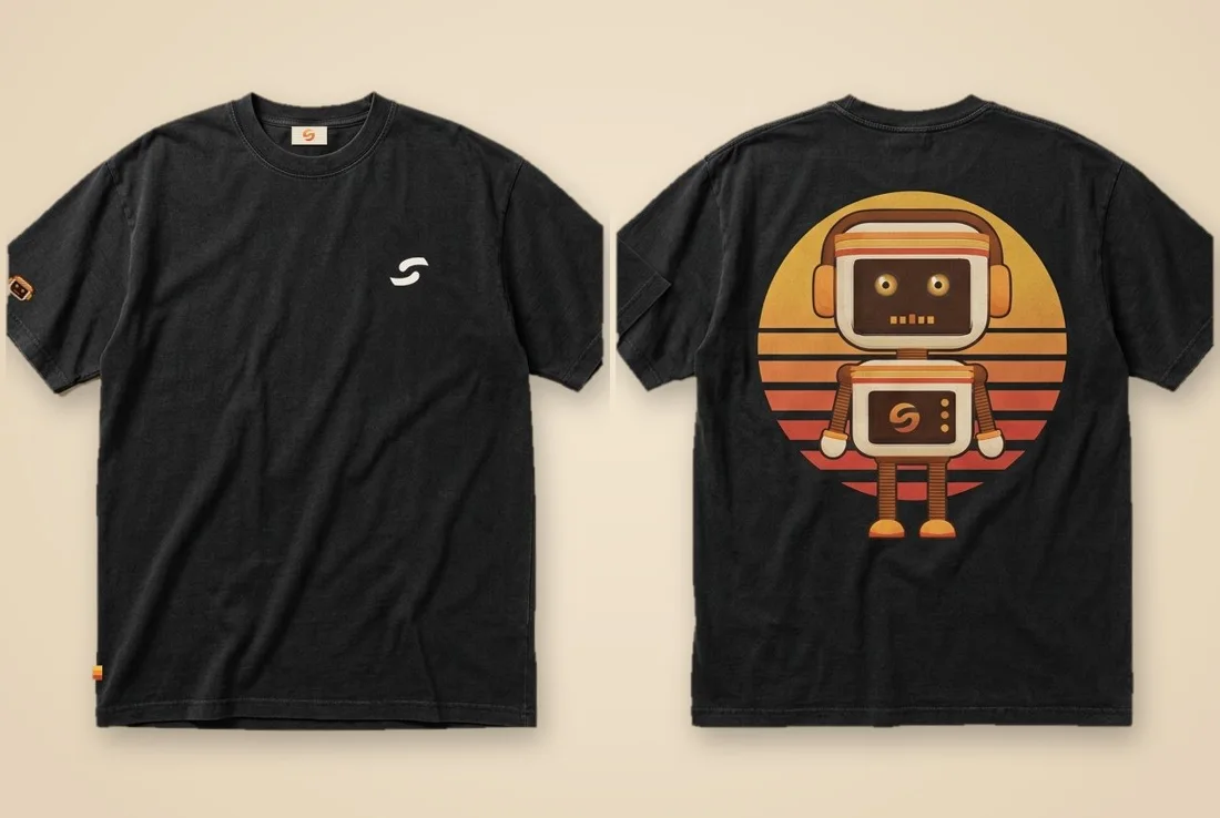
Stack’s robot DJ digs through your crate and picks the perfect record. He has headphones, a VU-meter face, a sunset headband and the S on his chest.



The
turnaround.
Always draw him from this model. Proportions are fixed: the head is wider than the body, the legs are thin coils, the shoes are orange.


Moods
and poses.











Use him
like a guest star.
- Use him for moments: a welcome, a pick, a tip, a celebration.
- Show him whole, feet and all, sitting on or interacting with real objects.
- Keep him smaller than the main content.
- Use one Selector per screen or page.
- Redesign him, change his colours or add a blue headband stripe.
- Crop off his legs or squash his proportions.
- Put him on every page or behind body text.
- Distort his eyes or give him a scary expression.
The digital
Selector.
For social, chat and anything that should feel online. Drawn on a 24 × 20 pixel grid with a 1px cream outline. Always scale in whole steps with hard edges.








 Wrapped is out!Join me on Stack
Stick it
on everything.
Die-cut with an even white border about a twelfth of the sticker’s width, printed on gloss vinyl. Slap them on at an angle.









Stack
Supply.

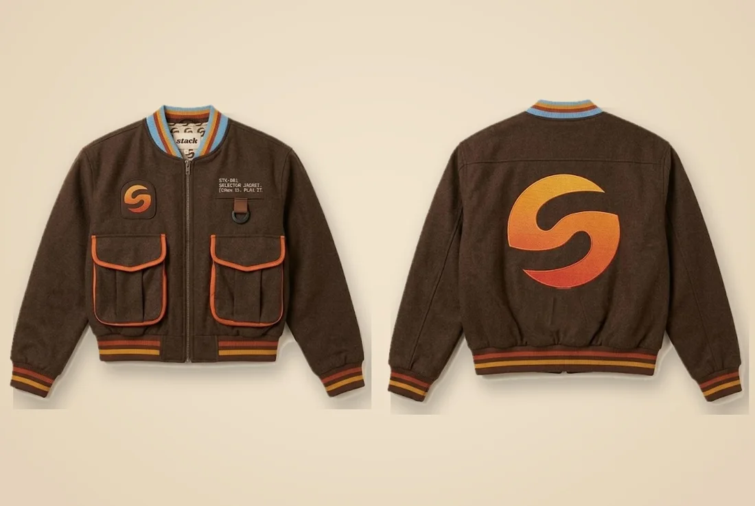
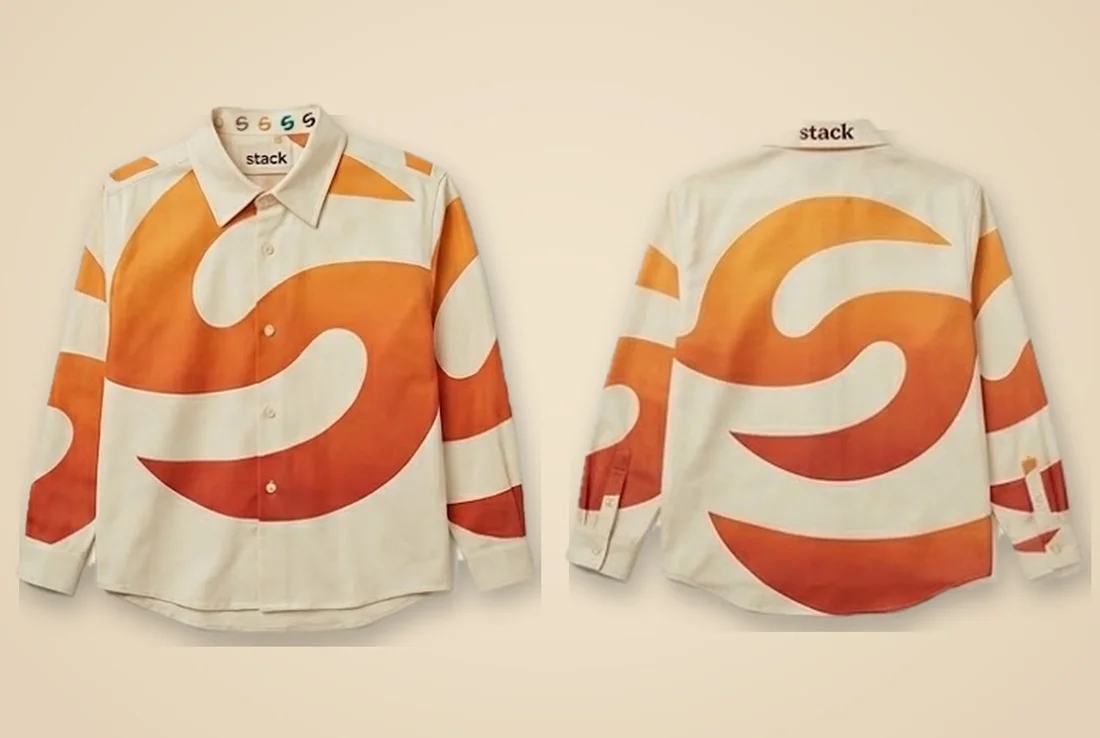
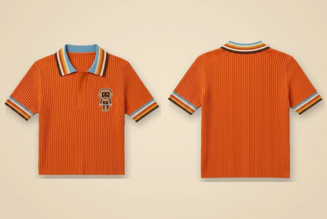
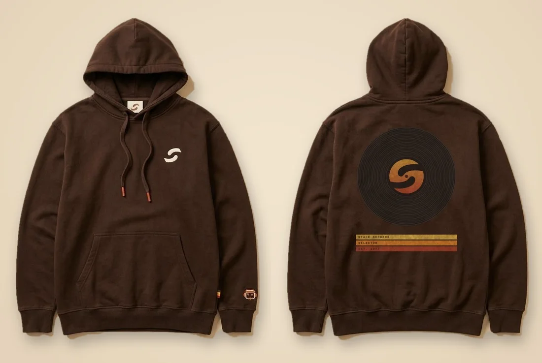
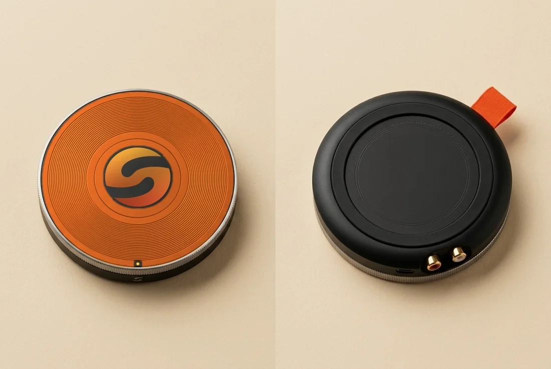
Record gear
and the Puck.
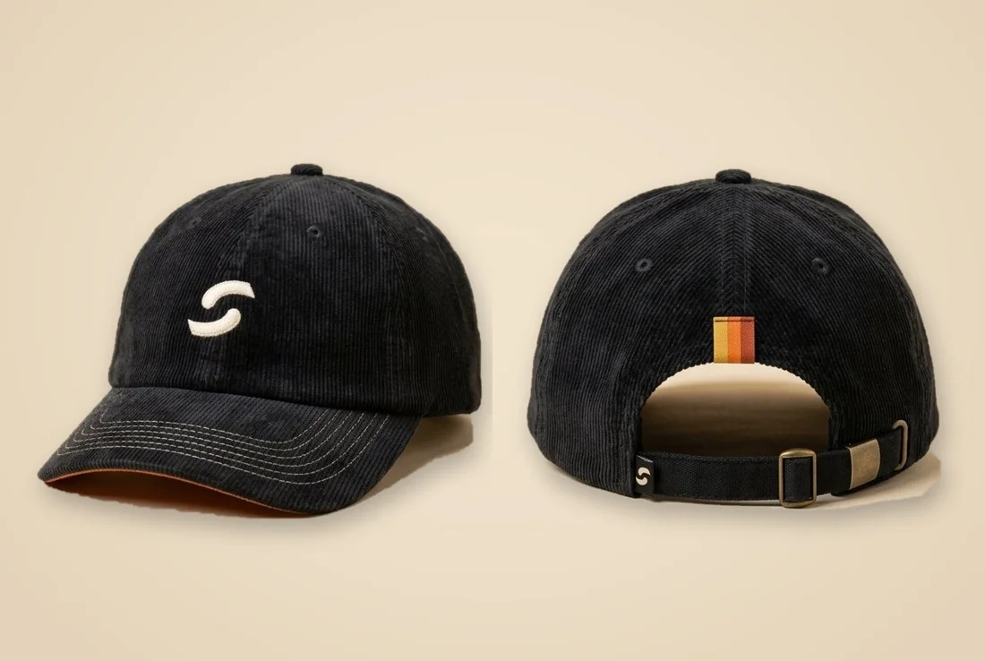
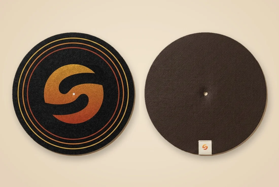
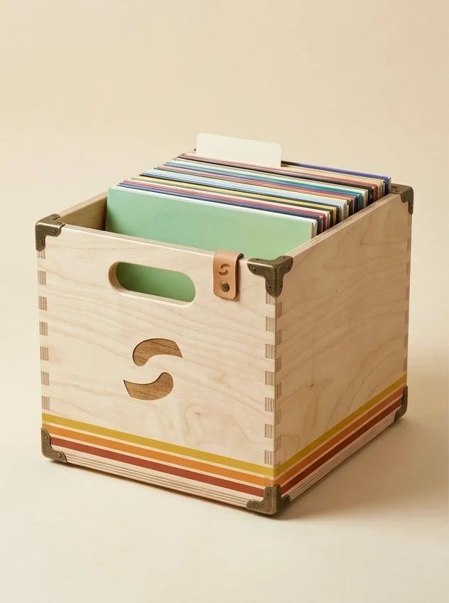
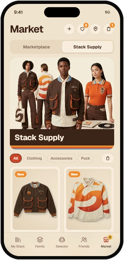
Merch uses the S mark small and embroidered, or the big sunset S as a statement. Never slogans.
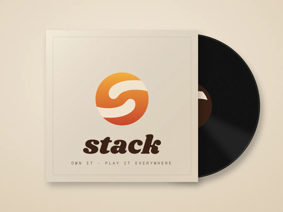
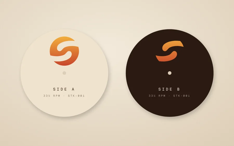
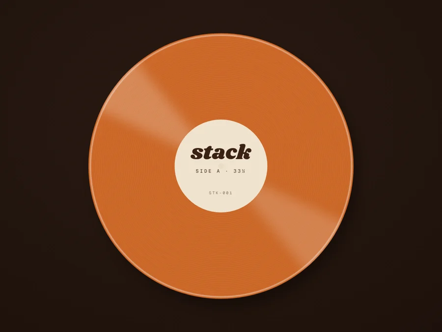
On
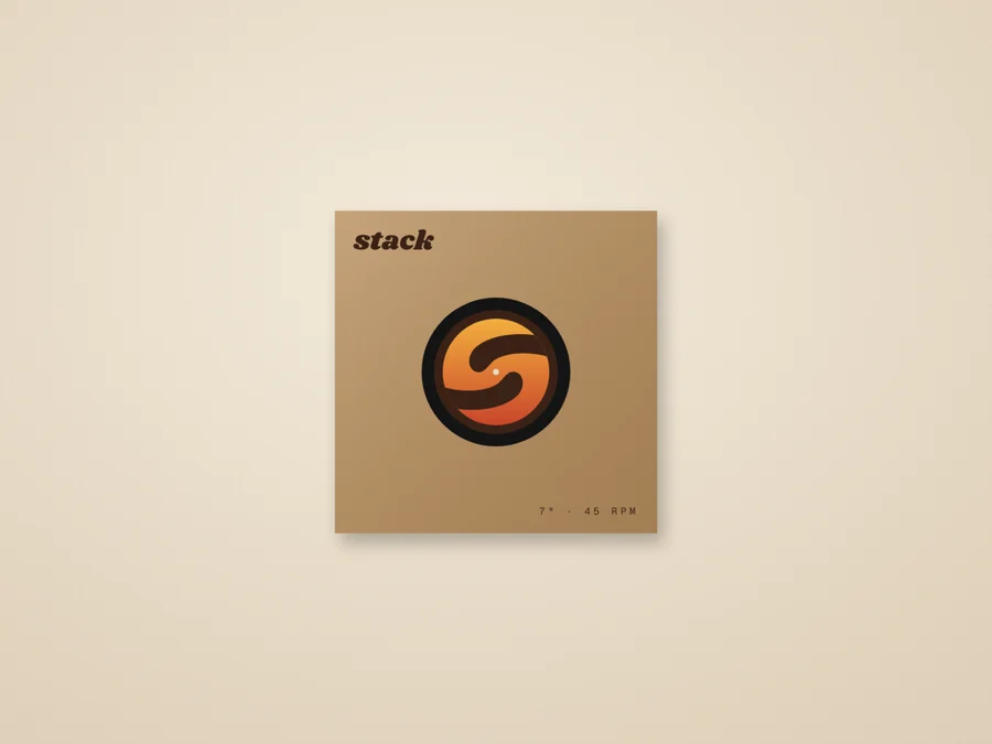
records.
In the
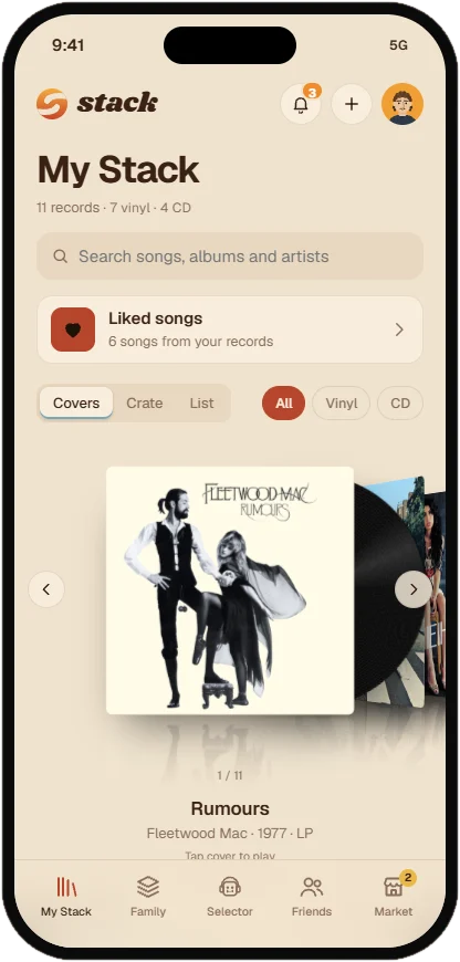
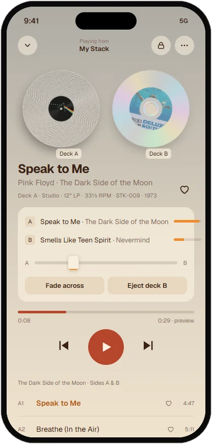
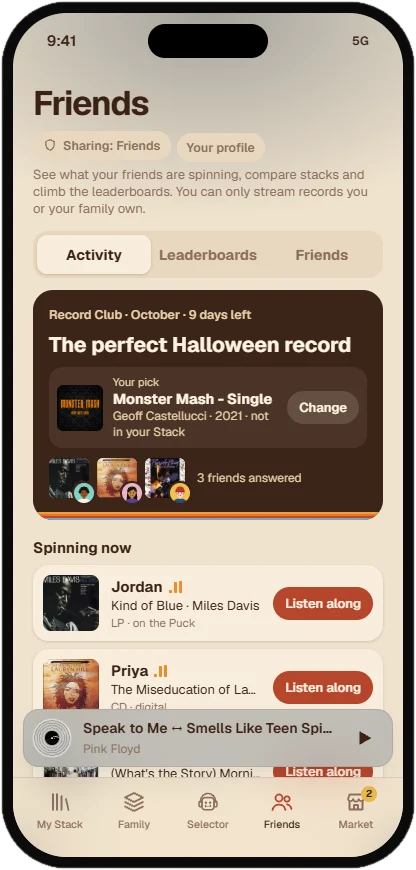
app.
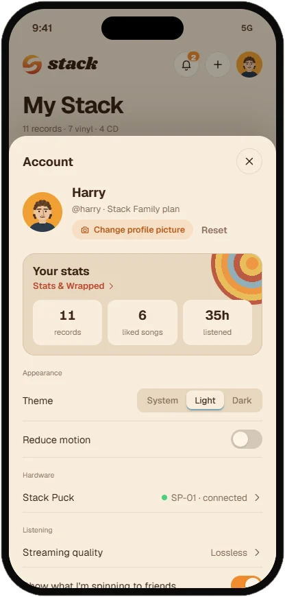
The app uses cream surfaces, rounded cards, one orange action per screen, and the stripe for moments of celebration.

Build it
the Stack way.
:root{
  --orange: #EF8B2C;
  --red: #C8452B;
  --gold: #F2AE3D;
  --cream: #F0E3CE;
  --paper: #F8EEDD;
  --espresso: #3A2216;
  --night: #2A1A12;
  --cocoa: #8A6E5E;
  --radius-card: 20px;
  --radius-pill: 999px;
  --space: 4 8 12 16 24 32 48 72;
  --ease: cubic-bezier(.2,.8,.2,1);
  --font: "Geist", system-ui, sans-serif;
}Own it.
Play it everywhere.
Brand files: harrisongreener.github.io/stackPitch/brand.html
Designed by Harrison Greener